SignUp Screen
- Published on
- • 4 mins read•--- views
- Authors
Preview
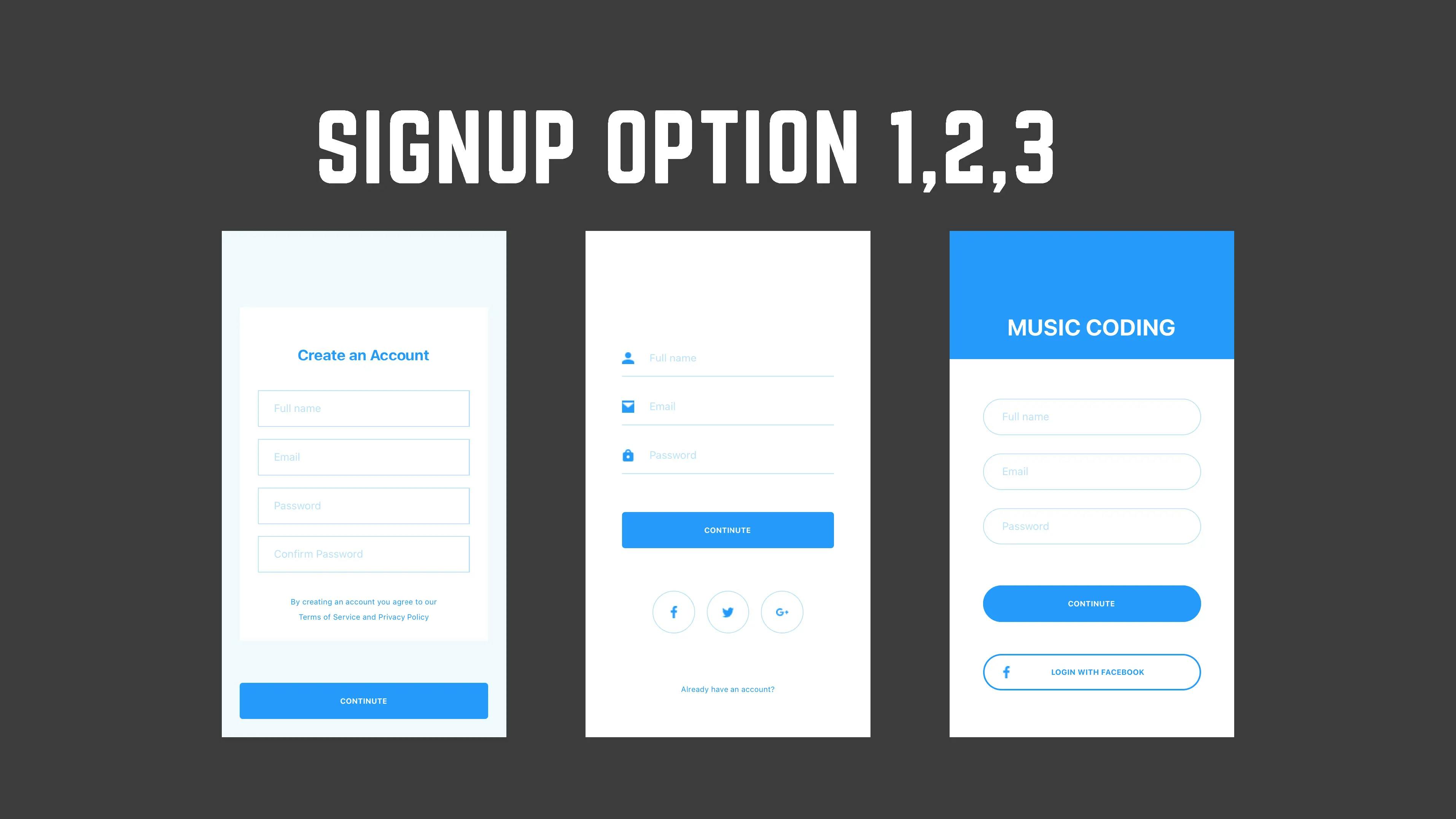
There are 3 signup screen options. Which one is your favorite? 😜
SignUp Screen Option 1
react
SignUpOption1.js
import React from 'react';
import { StatusBar, TextInput } from 'react-native';
import styled from 'styled-components/native';

const Input = ({ placeholder, secureTextEntry }) => {
  return (
    <InputField>
      <TextInput
        secureTextEntry={secureTextEntry ? true : false}
        placeholder={placeholder}
        placeholderTextColor="#BCE0FD"
        autoCapitalize="none"
        style={{
          marginLeft: 20,
          color: '#2699FB',
          fontSize: 14,
          lineHeight: 16,
        }}
      ></TextInput>
    </InputField>
  );
};
const SignUpOption1 = ({ params }) => {
  return (
    <Container>
      <StatusBar hidden={true} />
      <SignUpView>
        <TitleView>
          <TitleText>Create an Account</TitleText>
        </TitleView>
        <Input placeholder="Full name" />
        <Input placeholder="Email" />
        <Input placeholder="Password" secureTextEntry={true} />
        <Input placeholder="Confirm Password" secureTextEntry={true} />
        <PrivacyText>
          By creating an account you agree to our Terms of Service and Privacy
          Policy
        </PrivacyText>
      </SignUpView>
      <Button>
        <ButtonText>CONTINUTE</ButtonText>
      </Button>
    </Container>
  );
};

const Container = styled.View`
  flex: 1;
  background-color: #f1f9ff;
`;
const TitleView = styled.View`
  margin-top: 48px;
  margin-bottom: 24px;
  justify-content: center;
  align-items: center;
`;
const TitleText = styled.Text`
  font-size: 20px;
  line-height: 30px;
  color: #2699fb;
  font-weight: bold;
`;
const PrivacyText = styled.Text`
  margin: 20px 60px;
  font-size: 10px;
  line-height: 20px;
  color: #2699fb;
  text-align: center;
`;
const SignUpView = styled.View`
  height: 439px;
  margin-top: 100px;
  margin-left: 24px;
  margin-right: 24px;
  background-color: #fff;
`;
const InputField = styled.View`
  height: 48px;
  margin: 8px 24px;
  border-color: #bce0fd;
  border-width: 1px;
  justify-content: center;
  align-items: flex-start;
`;

const Button = styled.TouchableOpacity`
  margin-top: 56px;
  height: 48px;
  margin-left: 24px;
  margin-right: 24px;
  border-radius: 4px;
  background-color: #2699fb;
  justify-content: center;
  align-items: center;
`;
const ButtonText = styled.Text`
  color: #fff;
  font-weight: bold;
  font-size: 10px;
  line-height: 12px;
`;

export default SignUpOption1;
SignUp Screen Option 2
react
SignUpOption2.jsimport React from 'react';
import { Text, View, StatusBar, TextInput } from 'react-native';
import styled from 'styled-components/native';
const Input = ({ icon, placeholder, secureTextEntry }) => {
return (
<InputField>
<View style={{ flexDirection: 'row' }}>
<Icon source={icon} />
<TextInput
secureTextEntry={secureTextEntry ? true : false}
placeholder={placeholder}
placeholderTextColor="#BCE0FD"
autoCapitalize="none"
style={{
marginLeft: 20,
color: '#2699fb',
fontSize: 14,
lineHeight: 16,
}}
></TextInput>
</View>
</InputField>
);
};
const SocialAppIcon = ({ icon }) => {
return (
<SocialAppIconView>
<Icon source={icon} />
</SocialAppIconView>
);
};
const SignUpOption2 = ({ params }) => (
<Container>
<StatusBar hidden={true} />
<SignUpView>
<Input
icon={require('../../../assets/images/user_icon.png')}
placeholder="Full name"
/>
<Input
icon={require('../../../assets/images/mail_icon.png')}
placeholder="Email"
/>
<Input
icon={require('../../../assets/images/lock_icon.png')}
secureTextEntry={true}
placeholder="Password"
/>
<Button>
<ButtonText>CONTINUTE</ButtonText>
</Button>
<SocialAppGroup>
<SocialAppIcon icon={require('../../../assets/images/facebook_icon.png')} />
<SocialAppIcon icon={require('../../../assets/images/twitter_icon.png')} />
<SocialAppIcon icon={require('../../../assets/images/google_icon.png')} />
</SocialAppGroup>
<HaveAccountText>Already have an account?</HaveAccountText>
</SignUpView>
</Container>
);
const Container = styled.View`
flex: 1;
background-color: #fff;
`;
const SignUpView = styled.View`
height: 439px;
margin-top: 136px;
margin-left: 24px;
margin-right: 24px;
background-color: #fff;
`;
const InputField = styled.View`
height: 48px;
margin: 8px 24px;
border-width: 1px;
border-color: #bce0fd;
border-top-width: 0px;
border-left-width: 0px;
border-right-width: 0px;
justify-content: center;
align-items: flex-start;
`;
const Icon = styled.Image`
width: 16px;
height: 16px;
`;
const Button = styled.TouchableOpacity`
margin-top: 42px;
height: 48px;
margin-left: 24px;
margin-right: 24px;
border-radius: 4px;
background-color: #2699fb;
justify-content: center;
align-items: center;
`;
const ButtonText = styled.Text`
color: #fff;
font-weight: bold;
font-size: 10px;
line-height: 12px;
`;
const SocialAppGroup = styled.View`
margin-top: 56px;
margin-left: 64px;
margin-right: 64px;
flex-direction: row;
justify-content: space-between;
`;
const SocialAppIconView = styled.TouchableOpacity`
width: 56px;
height: 56px;
border-radius: 56px;
border-width: 1px;
border-color: #bce0fd;
justify-content: center;
align-items: center;
`;
const HaveAccountText = styled.Text`
margin: 63px 60px 0px;
font-size: 10px;
line-height: 20px;
color: #2699fb;
text-align: center;
`;
export default SignUpOption2;
SignUp Screen Option 3
react
SignUpOption3.jsimport React from 'react';
import { View, Image, StatusBar, TextInput } from 'react-native';
import styled from 'styled-components/native';
const Input = ({ icon, placeholder, secureTextEntry }) => {
return (
<InputField>
<View style={{ flexDirection: 'row' }}>
<TextInput
secureTextEntry={secureTextEntry ? true : false}
placeholder={placeholder}
placeholderTextColor="#BCE0FD"
autoCapitalize="none"
style={{
marginLeft: 24,
color: '#2699FB',
fontSize: 14,
lineHeight: 16,
}}
/>
</View>
</InputField>
);
};
const SignUpOption3 = ({ params }) => {
return (
<Container>
<StatusBar hidden={true} />
<Box>
<TitleText>MUSIC CODING</TitleText>
</Box>
<SignUpView>
<Input placeholder="Full name" />
<Input placeholder="Email" />
<Input placeholder="Password" secureTextEntry={true} />
<Button>
<ButtonText>CONTINUTE</ButtonText>
</Button>
<Button color="#fff">
<Image
source={require('../../../assets/images/facebook_icon.png')}
style={{ width:16, height:16, position: 'relative', right: 51 }}
/>
<ButtonText color="#2699fb">LOGIN WITH FACEBOOK</ButtonText>
</Button>
</SignUpView>
</Container>
);
};
const Container = styled.View`
flex: 1;
background-color: #fff;
`;
const Box = styled.View`
height: 169px;
background-color: #2699fb;
justify-content: flex-end;
align-items: center;
`;
const TitleText = styled.Text`
font-size: 30px;
line-height: 30px;
color: #fff;
font-weight: bold;
margin-bottom: 24px;
`;
const SignUpView = styled.View`
height: 439px;
margin-top: 40px;
margin-left: 24px;
margin-right: 24px;
background-color: #fff;
`;
const InputField = styled.View`
height: 48px;
margin: 12px 20px;
border-color: #bce0fd;
border-width: 1px;
border-radius: 48px;
justify-content: center;
align-items: flex-start;
`;
const Button = styled.TouchableOpacity`
margin-top: 42px;
height: 48px;
margin-left: 20px;
margin-right: 20px;
border-radius: 48px;
border-width: 2px;
border-color: #2699fb;
background-color: ${(props) => (props.color ? props.color : '#2699fb')};
align-items: center;
align-content: center;
justify-content: center;
flex-direction: row;
`;
const ButtonText = styled.Text`
color: ${(props) => (props.color ? props.color : '#fff')};
font-weight: bold;
font-size: 10px;
line-height: 12px;
`;
export default SignUpOption3;